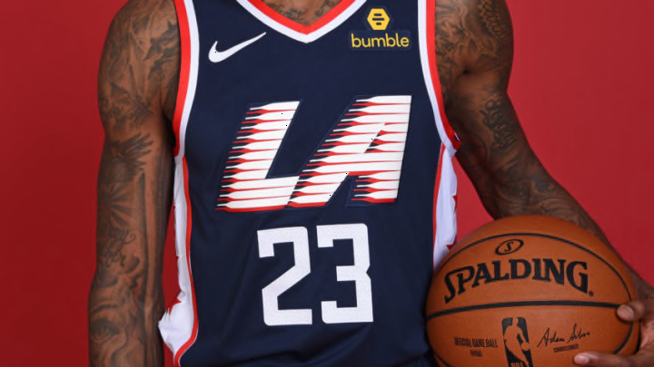
Awfully Familiar
18. Chicago Bulls
The Chicago Bulls City Jerseys from last season were fantastic, so they decided to not change much. Last years was white with red stars and hints of baby blue. This year, they changed the white to black, moved the star, added more blue, and dropped all of the front lettering. It might look sharp on the court, but the pictures are not wowing me.
https://twitter.com/chicagobulls/status/1061396189264912384
17. Washington Wizards
“The District of Columbia” is a bit wordy, but looks really cool on a jersey. The Washington Wizards went with an all white approach last year and it popped. They changed most of the white to black, and while it isn’t bad, I wish they would’ve tried something new.
https://twitter.com/WashWizards/status/1062466412801916934
16. Sacramento Kings
I am a fan of Sacramento’s baby blue jerseys from last season. Instead of going for a new approach, they just removed the lion logo from the front and replaced it with text that reads “Sac Town.” The logo was one of the best parts of the jersey last year. Again, I am annoyed with the lack of creativity and the reusing of an old concept.
15. Brooklyn Nets
The Nets City Jerseys are inspired by Biggie and have Coogi sweater patterns on the collar and arm trims. It’s a cool idea, but it is subtle and could easily go unnoticed and be mistaken for a regular Nets Icon Jersey.
https://twitter.com/BrooklynNets/status/1060701722656395264
Next up? Above average jerseys.
