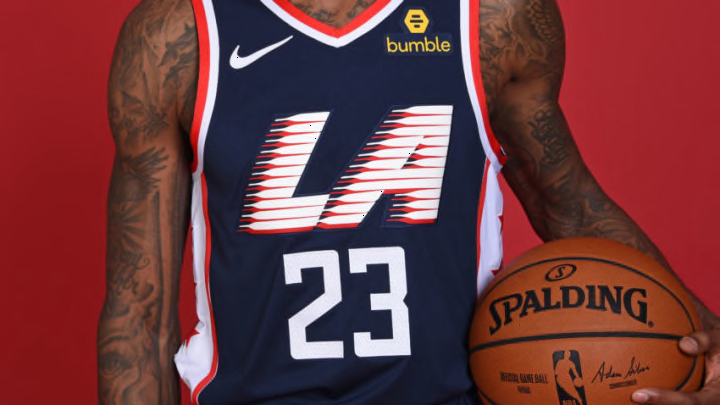
This is the second season that the NBA jerseys have been made by Nike, meaning the second straight season of NBA City Edition Jerseys.
Last year, all 30 NBA teams got an alternate jersey that was meant to represent their city and its people. Some were smash hits and others were meant for an alley way dumpster. This year saw the same spread from great to awful and I’m going to rank them all to see how the Clippers compare.
From 30 to 1, the placement will be based on creativity, originality, and personal preference. Prepare for the definitive 2018-2019 NBA City Edition jersey ranking.
The Worst of the Worst
30. Los Angeles Lakers
There is so much going on here. Black lettering on a purple background is not doing it for me, and the pinstripes make it even worse. These are a major step-down from last year’s black snake-skin Kobe Bryant tributes. This jersey serves as a reminder that not everyone can be a winner.
https://twitter.com/Lakers/status/1060834383672688640
29. San Antonio Spurs
In the past decade, the Spurs have been trying to popularize camouflage jerseys to no avail. Last year, they went with a black and grey digital-camo design for their City Jersey to represent the deep military history in San Antonio. It was received to mixed results and most people were hoping for an improvement this year. Disappointingly, they didn’t switch it up at all. They are one of two teams that kept the exact same jersey as last year. I didn’t have a problem with this jersey last year and I kind of liked it, but since they didn’t change it at all, I can’t help but feel let down. Hopefully they try something with their Fiesta colors from the late nineties next year.
https://twitter.com/spurs/status/1061481863787790337
28.) Dallas Maverick
It’s almost like the Dallas Mavericks like to see how goofy they can make Dirk Nowitzki look. Last season they used green and blue stripes on a black jersey with the letters “DAL” in the middle. I could go either way on it, but this is a definite downgrade. I have trouble getting into jerseys without lettering on the front unless they are really cool. These Mavericks jerseys just don’t do it. I hoping for a big step up next year.
Proud to have officially launched our Y2 City Edition Jersey! #TrueMaverick
— Dallas Mavericks (@dallasmavs) November 9, 2018
Shop the collection: https://t.co/BdAi10YPj7 pic.twitter.com/0b45ec4bkV
27. Memphis Grizzlies
When I first saw this jersey, I was convinced it was the worst jersey I’ve ever seen. It was redeemed just a tad in my eyes when I saw the yellow panels on the side. Last year, the Grizzlies had a fantastic all white jersey with black lettering that read “Memphis”. Its simplicity made it one of the best in last years group. This year’s is the exact opposite. The colors just don’t get the job done and the Memphis font, for all of their jerseys, is just terrible. Hopefully they bounce back from this next season.
Get your merch. Get your merch.
— Memphis Grizzlies (@memgrizz) November 9, 2018
New Nike City Edition “Main Event” gear is now in the team store located inside @FedExForum. pic.twitter.com/0Vl0O2afou
26. Orlando Magic
The Magic caught a lot of people’s attention with their galaxy-print City Jersey last year. It really captured the magic of Orlando, Florida. This year, they released the same jersey with one key difference: the galaxy printing is no more. There are some stars on the side panels, but the best part of last years is gone. Orlando could inspire some great jerseys, and this year’s jersey seems to be an overwhelming disappointment.
https://twitter.com/OrlandoMagic/status/1058027366851792897
25. Indiana Pacers
After putting out the best jersey in franchise history with their 2017 City Jersey, the Pacers had big expectations coming into the jersey reveal week. Rather than a racing themed jersey, they opted for a grey, yellow, and navy look that is very reminiscent of the Grizzlies new jersey. I was definitely let down by this. Perhaps last years all navy with a vertical checkered yellow racing stripe had me expecting too much.
https://twitter.com/Pacers/status/1060930913113198592
Now, onto the ‘Not as Terrible’ section.
