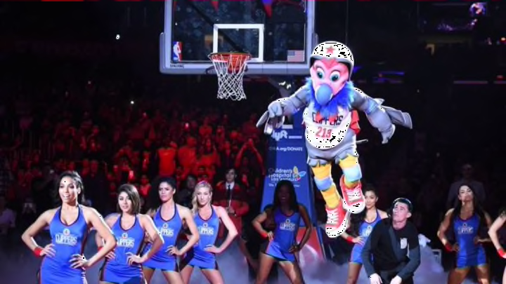
The Los Angeles Clippers have a strange new team mascot, and he goes by the name of Chuck the Condor.
After owner Steve Ballmer and the Los Angeles Clippers worked to redesign the look of the team with new jerseys and a new home court design for 2015-16, we heard fairly soon after that a new team mascot would be on the way at some point, too. On Monday night, we saw that mascot revealed as he descended from the rafters of Staples Center, going by the name of Chuck the Condor.
Whether you’ll like the new cartoonish character is up to you, but at least it’s good to see the Clippers having their own mascot representative. It just adds a little more to their identity in L.A. However, there’s still the matter of what the mascot actually looks like, and personally (along with most others by the looks of it), I can’t say I’m a fan at all.
Here he is, descending upon the court at half time:
Man. Bird suit. Trampoline. Massive dunk.
— The Association on FOX (@TheAssociation) March 1, 2016
Introducing the @LAClippers' Chuck the Condor.
(via @FoxSportsWest)https://t.co/RTC0AOfqtP
For more information on the thought process behind the mascot, Eric Freeman of Yahoo! Sports has reported that Chuck is based on the California condor, giving it historic value to the region:
"Chuck is based on the California condor, a critically endangered species with great meaning to the history of the state and various Native-American groups within it. It also happens to have the longest wingspan of any North American bird at 9.8 feet, which makes for a pretty clear connection to basketball. We cannot explain the Evel Knievel-like branding quite so easily, but nobody ever said every aspect of a mascot needs to make sense."
While there’s certainly appropriate reasoning for the choice of a condor due to its connection to California and current importance as an endangered species, there’s still no obvious connection to the actual Clippers basketball team itself. It feels like the Clippers could have gone further with the idea of the condor as well, or just gone in a different direction; instead of an overly child friendly, goofy design that brings up memories of old Disney characters.
i mean pic.twitter.com/Tge5P6sisZ
— nick (@nick_pants) March 1, 2016
In fairness to the design, though, mascots can be eccentric and bizarre, so perhaps some fans will grow to like it if they don’t already. On the other hand, would a slightly less goofy mascot — more similar to the nature of the Memphis Grizzlies or Chicago Bulls mascots — be an improvement?
Perhaps a character who looks less useless and covered in a helmet and pads everywhere possible could be improved upon with a mascot who looks a little… well… better. A condor could have made for a pretty nice mascot if designed in a more sleek and artistic fashion, rather than looking like a cheap cartoon.
Hey, we've decided the #Clippers need a mascot, and we're going to name him "Chuck The Condor" pic.twitter.com/w9spjg4PGW
— Michael Eaves (@michaeleaves) March 1, 2016
As you can see, the reaction online was largely negative. Basketball Twitter and members of Clippers nation didn’t exactly applaud the design after it was revealed at half time, and instead probably wished Chuck the Condor would just soar back to the rafters and disappear.
Next: Clippers may sign a new player
Again, when talking for myself and probably most others based on reactions similar to those above, a slightly more serious and well-developed design would have been preferable. For a team like the Clippers who want to rid themselves as the joke of the NBA playoffs for never passing the second round, a mascot who doesn’t look like a humorous character from a kids cereal box would have been the better choice.
